Thursday, October 04, 2018

Case Space v.2 - Mr. Grimaldi Edition

My guest this week in the Case Space is Brooks Middle School's very own Mr. Grimaldi, 6th grade science educator. Every day he enters the classroom, he's accompanied by an astonishing collection of top quality pencils. But let's not jump the gun and call him a collector. Although he has acquired a significant amount of beautiful writing instruments, his intent has always been to utilize them, not to let them sit collecting dust.

There is no greater evidence than with his use of Field Notes, pocket notebooks. Mr. Grimaldi can fill up a 48 page book faster than anyone I know. Writing has become a daily habit, and a way to connect with his family and experiences. Just ask him, he'd be happy to tell you how he uses them. His routine transcends the rich tradition of writing down facts, creating lists, and documenting events. Mr. Grimaldi's Field Notes are a collection of tiny scrapbooks, loaded with pictures and text. They are tiny history books, broadening his scope of life's events. They await a moment in the future, that will aid in the recall of events both passive and pivotal.

Through the consistent use of a variety of pens and pencils, Mr. Grimaldi has had first hand experience with the quality and feel of different types of wood and graphite. He prefers soft graphite. And long point sharpeners. And tip protectors. And vintage pencils. And experience. And sharing.

Here we go. This is a detailed endeavor. Read. Re-read. Absorb. Reflect. Question. Research. Enjoy.

"Did you choose your pencil case, or did your pencil case choose you?"

Mr. Grimaldi: "I chose my pencil case. Being new to the world of pencils, when I first started it was Palomino Blackwings all the time. They are generally longer than most common pencils, so I wanted to find a case that would hold unsharpened Blackwings. The Lihit Lab Pen(cil) case does just that."

"So, what's in there? Tell me a little bit about what's stored inside."

Mr. Grimaldi: "At first, it was just Palomino Blackwings. I have acquired every iteration of the limited edition Blackwing Volumes as well as the regular releases (602, Pearl, and MMX). One of each is with me at all times. I was recently introduced to other great pencils, and now I carry a variety of Tombow, Mitsubishi, Viking, and Nataraj along with my Blackwings. I carry about 30 pencils with me in my Gali Teck Tactical Backpack

I started with loving the more firm cores from Blackwing, such as those found in the vol. 24 and vol. 54. As I've evolved as a writer, I love the darker lines of the softer leads from Blackwing, such as their balanced and soft cores. With other pencils that use traditional graphite grades, I prefer B and 2B in non-Japanese pencils. The HB grades in most Japanese pencils are much darker, so I don't mind the HBs from Tombow and Mitsubishi."
"Do you have a favorite item?"

Mr. Grimaldi: "My favorite changes daily. I am currently calling my favorite the newest Blackwing Volume, the 33 1/3. It is a matte black pencil with a matte ferrule and black erasure. The foil stamp of Blackwing and Volume # stands out very well on the matte finish. The core is that of the Blackwing Pearl, so the 2nd softest core they make, and it writes like butter. It is so smooth and dark...could be my all time favorite at the moment. But if you ask me next week, it will probably be different."

"Do you have a pencil/pen recommendation for others?"

Mr. Grimaldi: "Plaomino Blackwings are rather expensive for an everyday pencil, so I would recommend the Tombow Mono, Tombow 2558, Tombow 8900, Mitsubishi 9800, or the Mitsubishi 9850 or 9852. In terms of pens, I have found a new love...the Retro 1951 Tornado Rollerball. It is a hefty pen, and I used a Schmidt .5 rollerball refill. It is wonderful."

"What's missing? Is there anything on your wish list that you'd like to add to your case?"

Mr. Grimaldi: "I've been fortunate enough to be able to get whatever I want for my pencil case. As of now, I don't have anything on my wish list."

Wednesday, September 26, 2018

Case Space - Aiden W. Edition - v.1


My recent purchase of a new pencil case gave me the strange idea to start featuring the cases of students and other teachers. These cases have a personality all their own, and I think they deserve some recognition.

So, I'd like to announce the beginning of the D304 Case Space - A safe place to share your case.

Each segment will feature the pencil case of a student or teacher, and will be accompanied with a short interview about its contents, so you can hear directly from the owner.


My guest this week is Aiden W., an 8th grade cartoonist. I've had the pleasure of working with him for more than one school year here at Brooks.

Aiden's dedication to his art was apparent from day one. He has been developing his skills consistently, and exploring his personal voice as a young artist. If you haven't yet, you need to say hello to Aiden, or at least shyly peek over his shoulder to see what he is drawing. It's inspiring.

Without further ado, here's the first installment of the Case Space.

Let's see that case and hear what he has to say!

Aiden's Pencil Case and Sketchbook.
"Did you choose your pencil case, or did your pencil case choose you?"

Aiden: "I chose it, the form factor is good, letting me put tons of stuff inside, having a smaller compartment is also nice for smaller items beside pencils."

"So, what's in there? Tell me a little bit about what's stored inside."

Aiden: "Right now, I have a bunch of standard ticonderoga pencils, which feel nice, but having to sharpen them is weird after using my mechanical pencil for a while, and I have a pencil sharpener as well, there are also some items I don't usually have inside, like white out, Frixion erasable pens, and sakura pigment pens. (also extra erasers)"

"Do you have a favorite item?"

Aiden: "I really like the twist erase 0.5mm pencil, it feels really precise for sketches, the fact that the eraser can be longer with a twist is super convenient."

"Do you have a pencil/pen recommendation for others?"

Aiden: "I'd recommend erasable frixion pens for people like writers, they feel amazing and the eraser is a nice touch."

"What's missing? Is there anything on your wish list that you'd like to add to your case?"

Aiden: "I've heard good things about Brush pens, and I'd like to pick one up, they look pretty cool."

Friday, September 14, 2018

Early Stage Learning Mascot Design

We recently began creating learning mascots in Applied Art and Art Foundations. I'll be posting again with more detail about what they are and how we'll be using them, but I wanted to share these before and after drawings by 6th grader Harper S.

These images illustrate the change from a fully detailed drawing, to a more simplified one that captures the spirit of the original. It helps us see the dragon in a new and interesting way. Udros, Lord of the Sea, has transformed into a softer, simpler version, leaving the young artist with an opportunity to render the character more quickly.

Although not all students are starting with an intricately rendered character, Harper's example helps me talk with students about the transformation and evolution of ideas, and how a line drawing is quicker to replicate for our purposes of sketch-noting.

Mr. L

Tuesday, September 04, 2018

Rad Pencils Vol.1 - General's Semi-Hex HB

When we first come into contact with art materials and writing utensils at a very young age, we don't think much of what is handed to us. 

Here's this thing. It makes a mark. I can share my ideas with it.

I'm sure a majority of us remember the Crayola logo very well, and the fact that pencils were for the most part, yellow, and that's all that mattered.

At some point, there's a chance we may stick with drawing or writing, and may seek out materials that resonate with our senses to fully accentuate our vision and ability. The reasons we continue to draw or write are varied, and are worth exploring in future posts, but here, I aim to tap into the part of us that is drawn to new materials for the purpose of exploration and intrigue.

My selection for the very first pencil of the week is one of consistent quality, that I have enjoyed since purchasing my first 12 pack last year. This is the General Pencil Company Semi-Hex HB. 
General's Semi-Hex HB
I have tested four aspects of this pencil.

1. Point Retention
2. Darkness
3. Smudge
4. Erase


I learned of testing these pencil attributes from one of my favorite YouTube channels, Wood & Graphite, in which the host, TJ, reviews and tests a variety of pencils. I have created my own testing sheet using Canva. Feel free to use my template HERE. I print several at a time and bind them into paper pads I can tear off as needed.

RESULTS:

The General's Semi-Hex HB does not disappoint. It is made of incense cedar with a hexagonal shape that is "slightly' more rounded than others, hence the name semi-hex. It sports a gold, aluminum ferrule with a black painted band, and I believe a rubber eraser. It's a nice looking pencil, but I have noticed some issues with the quality of the ferrule. The assembly process tends to bend them out of their circular shape, and the black painted band wears off rather easily.

That being said, the Semi-Hex is a solid everyday pencil. Great for writing, sketching, and marking. It sharpens rather well and the the point lasts pretty well under regular circumstances. The smudging is minimal and it erases somewhat neatly with the attached eraser.

The Semi-Hex can be purchased online through Amazon or Pencils.com

Friday, August 31, 2018

Animated Character Drawing


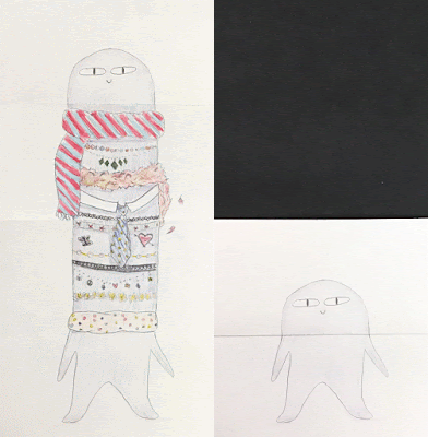
To start off the year, my colleague and dept. chair Mrs. Murray suggested this really great idea that developed from a question she asked her son. Mrs. Pabellon and I agreed that creating these animated character drawings would be something fun to get the kids thinking and sketching right away.

We jumped in at our department meeting, started making examples, and worked out the logistics of materials, paper size, folding, and differentiation.

6" x 12" paper.
1. Fold Bottom up.
2. Fold Top down.

The concept is simple: Fold your paper. Draw a character. Unfold your paper. Fill in the rest of the character.

The possibilities are endless, and we have the option of expanding the lesson by creating animations or .gif's of the final product.

Here's my example:

I asked my 6 year old son Iggy to make one too:)


As I was preparing my presentation for the kids, I decided to take a risk on an idea to try something new. I used a minimalist approach to get my classes thinking, and engage in the creative process.

Here is the presentation I came up with. I only read the large words out loud. I asked them to read the small words to themselves. This is where it all began.


As an art department, we created several prefolded pieces of paper with simple shapes for anyone that might find themselves struggling to get started. We presented the project, shared examples, and gave time on day one to simply to develop their concept and character.

It was a blast seeing what the kids started to come up with. There's such an energy that you can feed off of in order to support and nudge kids to do their best. But let's be real, not everything runs so smoothly for every student. As an art educator, you're called on to problem solve on the fly for those who need a little more support in generating an idea. One of the challenges I face is trying to lead kids to an idea, rather than giving it to them. You can plan for some of this, but ultimately you can't plan for all of this.

Here are some examples of the finished product.

Sonia G - Grade 8
Wilson K - Grade 7

Violet A - Grade 8

Ava B - Grade 8

Anne S - Grade 8
I didn't know where this project would take us when it started, but that's honestly been the best part of it. I took a risk, and am hoping that my Ss remember that fact as we continue through this school year. Creativity Takes Courage. Sometimes it works, sometimes it doesn't. 

-Mr. Leban


Thursday, March 22, 2018

#WalkWithMe - Bridgeport Art Center Professional Development Day


On March 20th, 2018 our D97 art staff visited the Bridgeport Art Center to learn about the artists and programs at Project Onward, and to receive a gallery and studio tour. 

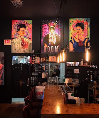
Frida's Room Interior

It all began with a stop at Frida's Room, a Mexican/American breakfast grill in the Pilsen neighborhood. We gathered for some conversation and to discuss how the days events would connect to our classrooms.

The ambiance was awesome. There were several large paintings hung alongside some framed smaller pieces with drawings or objects in them. All in all, it was a very relaxed atmosphere, a great place to start the day and put our thinking caps on.

Frida's Room Interior

Bridgeport Art Center Facade

It was a chilly and windy day although the sun did attempt to peek through. As we approached the building we could see several large sculptures ahead (like the one in the title image above). It set the scene nicely for what we were about to encounter inside.


We made our way through a loading dock and stumbled across a large freight elevator that took us to the 4th floor. I snapped this shot seconds before it started closing and ran to make it on.
Impressive, no. Fun, yes.

Project Onward Reception Desk

Through the several winding twists and turns of the hallways, we followed the tape arrows and wound up at Project Onward.

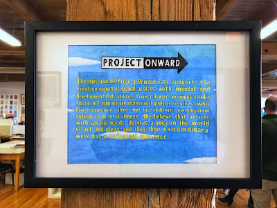
 "Project Onward is a nonprofit studio and gallery for professional artists with mental and developmental disabilities."

"Project Onward serves 50 artists, each with unique creative styles and facing diverse challenges, from autism to mental illness. All artists pass through a competitive selection process that evaluates their artistic talent, potential for creative growth and desire to advance as a professional artist before joining Project Onward. Member artists range in age from early-20s to early-70s and represent over 30 Chicago neighborhoods and several suburbs."


While in the studio/gallery space, the staff greeted us and shared a bit about the history and mission of Project Onward. They have made some incredible connections with their artists, many of which receive commissions on a regular basis. A connection we noticed between their approach and ours as teachers, is the role of facilitator. Rather than telling the artists what to do, they provide guidance and support, while pushing their abilities, in order for each artist to reach their highest potential.

If you are so inclined, please donate here.

click
Our first stop was at the work-space of artist William Douglas. He shared his most recent work with us, and talked about his process. As a result of her conversation with Bill, D97 Art Educator Jenny Raia said, "It was inspiring to hear Bill talk about his experiences as a child making art. He's so grateful that he had an art teacher in elementary school that recognized his talent and encouraged him to create. He now uses his art to help manage his mental health challenges and express himself. Talking to him really underscored the importance of building strong relationships with all of my students. I want them to use art as a positive force throughout their lives."


I love the look of artist workstations and the materials they use. I dedicate a place in our Artsonia student gallery to this. As we navigated around the studio space, I couldn't help but take some shots of some of my favorite studio vignettes. Look closely at the work being created here.

work-space 01

work-space 02

work-space 03

An artist really needs their own creative comfortable space, surrounded by their favorite materials. However, even with a dedicated work-space, and their own sense of independence, the artists of Project Onward talked about the community aspect and sharing of ideas that happens during any work session. Collaboration is paramount in keeping perspective, working out ideas, and finding your personal voice.

Artist Fernando Ramirez
This is Fernando Ramirez. He paints portraits, characters from mythology, and famous Chicago locations. His work is full of color and detail. I was completely blown away when he mentioned that the individual portraits in the top row take only about 30 minutes to create. Check out his work and a painting of The Beatles Sgt. Peppers album cover on Instagram @fernandoramirezfineart.

Bridgeport Art Center Main Gallery
The afternoon found us in the main gallery with our host, artist, and curator Lelde Kalmite. She talked about the current collection and gave us a tour of the space. The building is slowly being taken over by the art community as there are studio spaces for rent, and the galleries have been expanding. We had some time to look around and view the artwork, as she highlighted various pieces.


It was fun to see art teachers in their element discussing and getting inspired by the work in the gallery. It's so important for us to be engaged in ongoing conversations about modern art, art making, process, intent, and ultimately figuring out ways to make these ideas and concepts accessible to our students. The world must be our textbook.

Art Discussion with Lelde Kalmite
I would recommend to my students that whenever possible, listen to artists talk about their work. You not only learn about them, but it's inevitable that you will learn about yourself. Listening to Lelde talk about her work pinpointed a necessary phase of evolution that artists go through as they explore their own media and vision. You must learn to work on your work.

Studio Space of Artist Lelde Kalmite

This is D97 Art Educator and department chair Jennifer Raia. I took this shot near the end of our experience to give you a better sense of the space we were in. Every turn we made was greeted with artwork. There were paintings, collage, mixed media, graffiti, photographs, sculpture, and a piece that was 3-D printed. It was refreshing to see new technologies work their way into the art world as a viable way to share ideas. Our students that continue to explore art, or that find it as they evolve, will no doubt benefit, utilize, and revolutionize new ways to express themselves.


Some take away thoughts from our Institute Day, 
compiled by D97 Art Educators Kristen Sundquist and Casey Klemp:

•Specific approach to facilitation.
•Alter our mindset, from teacher to facilitator.
•Push students to reach their potential.
•Mindful of student needs, adjust the approach.
•Art careers for all types of artists.
•Artists who are relevant & relatable for students of various cognitive abilities.
•Introduction to a community resource.
•Use of kid friendly materials (i.e. cardboard & color pencils, glitter)


stay awesome.

Friday, October 06, 2017

#MyFavoriteThings - Field Notes


Objects shape the way we create. 

Some of my favorite objects in the world are my Field Notes made by Draplin Design Company. Their motto of, “I’m not writing it down to remember it later, I’m writing it down to remember it now", is so true for me. I often never look back at my notes like a to-do list. I use them as a creative outlet for my thoughts, the days events, places I've been, and even as a sticker book.

The first book I began writing in is pictured below, and in the graphic up above. This is the Chicago edition, in trademark colors and stars. It is quite worn and bent at this point from countless trips in and out of my back pocket. The inside consists of 48 pages printed with a 3/16" square grid, perfect for planning out ideas, doodling, graphing, and making lists.

Give the slider a shot to see my book inside and out.


As an artist and a parent I can't help but share my interests with my son. This is his book in Red, his favorite color. His book is the Illinois County Fair edition. Like mine, it is 48 pages and printed with a 3/16" grid. It is filled with various stickers, carnival tickets, and scribbles where he pretended to be writing.
For my last birthday my wife, Mrs. Leban:) gifted me a quarterly subscription to Field Notes. They send two packs of the newest edition, and usually throw in a few bonus goodies like pencils, patches, and pins. Needless to say I'll have plenty of new books ready to go in the future. If you're in class, see me writing in one, and are interested in learning more, or making a little scribble, please ask. 

What are some of your favorite things? Comment, blog, photograph, and share with us. 


-Mr. Leban

Thursday, October 05, 2017

Chromebook Keyboard Shortcuts


My district has shifted to using 1:1 chromebooks this year and I'm really enjoying the Google apps for Education connectivity and convenience. In addition to the way information, materials, and assignments are shared, there are some accessibility features that are worth a second look.

If you're stricken with curiosity and like to play, or if you're feeling in the dark and frustrated when one of your students descends upon another's device to flip the screen or shut it down, I've created something that may help.


Click the image below to view my Chromebook Keyboard Shortcuts quick reference online. This is a live document that I will update periodically with new items. 


Click me to view on the web

I post this list in Google Classroom for my students, and hang it up around my room. They can choose for themselves what features help them make the most of their learning on the chromebook. In addition, you can empower them to take the power away from those that use these features to frustrate others. If everyone knows the shortcut, it no longer becomes a tool of bother.

-Mr. Leban

Thursday, March 09, 2017

Museum Hack Tour - Art Institute Chicago

My wife Jen and I had the pleasure of participating in a tour of the Art Institute Chicago lead by a company called Museum Hack. Museum Hack leads "renegade" museum tours (currently in NYC, DC, San Francisco, and Chicago) that are engaging, interactive, and entertaining! As a visual arts teacher, married to a former visual arts teacher, I was intrigued by how Museum Hack would take the Art Institute and "hack" it for our tour group.

Our tour guide's name was Elise, and she was very friendly and welcoming. We met our group in the museum's main stairway entrance (after buying our tickets and checking our coats), and were given name tags. There was a group of eight adults, not counting our tour guide. This was awesome for me because it was easy to remember who was in my group, and to follow the group through the museum.

The Art Institute is HUGE. Our two-hour tour was a whirlwind sample buffet of artworks throughout time and cultures. Elise delighted in telling us all about the "saucy" details of Rococo art, and the epic "comic book" panels of St John the Baptist, including a ridiculous and gratuitously bloody beheading scene:

Mrs. Leban & I chose this painting as our favorite in the series.
Elise called them the worlds first comic book.
A good half of the tour is finding out interesting facts and little-known/fun trivia bits about different pieces in the museum, and the other half was interactive - we participated in a variety of games and fun discussions about the artworks.

Of course, our tour included Sunday Afternoon on the Island of La Grande Jatte by Georges Seurat, where we all had our Ferris Bueller moment staring at the various subjects within the landscape, and selecting our favorites:


Elise pointed out this little figure shaped like a keyhole. I was fascinated with all of the dots that have fallen off over the years.
One of our interactive moments included a game in a smaller gallery where we selected furniture and decorative items for Elise's fictional "housewarming" party for rich people. We got to select an item from the gallery that we would bring for her new house. Then we hilariously tried to connect them together ("Ohh that bowl would look great on the table Jen picked! And we could hang Todd's creepy painting above it!").

Another fun game was had in the sculpture gallery where we were tasked with choosing a sculpture that represented our "spirit animal." My wife and I chose one for each other. She suggested I have an epic beard-off with this guy:

Elise took polaroids of us with our sculptures, and we got to take them home as souvenirs. We also wrote postcards about our experience that would be sent later on.

We went over to the modern wing, and it was no surprise to me that we stopped at every kid's, and my favorite sculpture in the entire museum:

This piece is called Untitled (Portrait of Ross in L.A.) by Félix González-Torres. Yes, you get to actually participate in the piece by taking and eating candy. In the museum. It's always funny because people are so trained to NOT touch the artwork, or to get too close, that it feels taboo to actually take and eat candy! I found a fun article here all about where the candy comes from and how it gets refilled.

To finish the tour, we ended up in the reconstructed interior of the Chicago Stock Exchange Trading Room, where we learned about the laborious practice of one dedicated man who rescued and preserved the architectural elements of this room, originally designed by Louis Sullivan and Dankmar Adler. We were also asked to share a picture of one item from the museum that we would bring to a party. My suggestion was voted the winner and I walked away with a souvenir sticker book of abstract painter, Wassily Kandinsky.
In the end, this got me thinking about how much a teacher can learn from this tour: how easy it can be to engage a group of students by simply making them get up out of their seats and physically mimic an image or concept, or by having them choose an item from a whole grouping and explain their choices.

But most of all, by not taking any of this too seriously, we were able to relax and have fun, and probably retained way more information about works of art than any other prior visit. Without even trying!


I really enjoyed my Museum Hack tour, and if you are in a city that Museum Hack conducts tours in, I highly recommend going on one! Museum Hack offers general tours (like the one I went on), but they also offer private/family tours, tours for parties, and team-building adventures! Can you even imagine, a professional development activity like this? I can.

Mr. Leban

Monday, March 06, 2017

D304 Art Highlight - Wood Cutout

Wood Cutout by Lauren F., grade 7.
Success! This positive/negative space wood cutout was designed and cut by Lauren F., from 6th period Applied Art. It measures 7 1/4" x 10" and was cut with a coping saw. Students used a hand drill to make holes in the corners of the negative space. The blade of the saw is removed and replaced after it is fed through the board. Students move the board and saw often to cut out the negative spaces, leaving only their design.

Mr. Leban